My start to brief one was slow as I wasn't making enough physical experiments, which meant I wasn't able to develop a strong chain of ideas to expand the range of influences on the initial ideas, this meant the scope of the project as a whole was limited. To the contrary, I immediately started making mock ups of my ideas for brief two which allowed me to experiment with a wider range of related process' and ideas, in turn creating outcomes which were more substantial and refined. This management of time (in brief two) allowed me to enjoy the process more as I was more in tune with the process and felt more in control of the development as I was able to experience different medias and decide which meshed best with my project and my personal design preferences.
Finding out the aesthetic I wanted to follow, early on really helped me enjoy the whole process more and creating mock ups and developments at a faster rate, allowing me to get better feedback in return. If had taken this approach in brief 1, I feel that I would have created a substantially larger amount of work, with more process' involved. Finding a preferred aesthetic early on will be key in moving forward, as for me, it pushes my production as I want to work around and push the possibilities/ limitations of a process in relation to how it can portray an aesthetic/form i'm drawn to.
I feel as though my research was more refined/developed as well as taking inspiration from a broader spectrum of artists and processes, as my project progressed in brief 2 in comparison to brief 1; this allowed me to have more developed and informed experiments. These informed developments meant that there was a clearer arc of progression on my blogs for brief 2, presenting a clearer vision of what I am presenting and why each element has been designed and how they link to each element of the production.
Wednesday, 27 November 2019
Evaluation
- metal on plinths and slabs - similar to previous experiments
- make it more obvious that it is an exhibition space - people in shot moving objects around
- turn by themselves?
- how could the lack of interaction change dynamic?
- how could a bigger budget change the installation?
Friday, 22 November 2019
Installation (Gallery Setting)
The aim of this projection was to test how an interactive installation could be presented in a gallery setting.
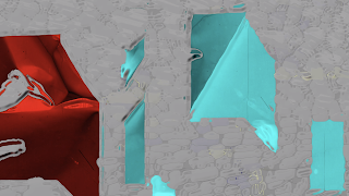
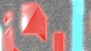
A projection based on the disorientation and change that gentrification can and has caused to some of the locals of Kelham Island and other areas which have under similar gentrification projects. The imagery used is made from distorted imagery from Kelham Island. Using scanned textures of materials which would be found and manufactured on Kelham Island and photoshop settings, the imagery is bold, fast paced and disorientating; as to present the impact of the change to Kelham Island locals.
Moving forward from 2 dimensional visuals, this projection aims to encourage an interactive aspect through the addition of movable plinths and slabs. These objects have been introduced as to add a physical dynamic to the projection and to present a connection between the physical industrial structures that have been regenerated/gentrified on Kelham Island. The ease of manoeuvrability of the plinths and slabs enables the audience to simply move them through the projection, in turn manipulating/disorientating the form of the projection. With the aim of the aesthetic of the physical objects being as 'blank' as possible, as to allow the projected imagery to dominate the space and show a sense of change in the visual of the space; the audience is given the option to either watch this projection through the already established form that has been placed together (slabs and plinths) or change it by moving them about, therefore presenting a new regenerated aesthetic which is clearly presented on the blank surfaces. This sense of change over time is something that could be presented in a gallery space by changing the materials of the objects over the time of installation in a gallery, allowing the materials and audience to interact with the space/installation differently each time they enter it.
I have decided to present just one projection of the heavily distorted imagery from Kelham Island, instead of presenting the dynamic of two opposing projections (old imagery and new imagery) where the two projections would be presented in the same space but on separate objects at different depths, so that the audience could be presented with the change of Kelham in a physical aspect (one set of imagery behind the other). While the imagery is very disorientating and obscure, the text brings context to the projection - presenting the themes within the brief (opposing views of Kelham locals towards gentrification); while also interacting with the changing forms within the imagery (type presenting the themes within the quotes in an illustrative approach). The complex sets of imagery contrast ad work effectively with the blank spaces of the plinths and slabs.
If there were to be any changes to the installation/projection; it would be that the materials would change over the time of the exhibition, this would be through the type of material of the objects and the quality of these materials (the form and shape of the object would stay the same as to keep a sense of consistency - in relation to the fact that Kelham Island is still the same place; just the aesthetic and manufacturing process' have changed)
Set-Up + Angles of Installation
Looking at the set up of the 'gentrification glitch' installation. The plinth and slabs fragment the imagery, creating a number of new angles you can view the projection from. These new viewing angles pose the question of whether gentrification narrows or opens up new opportunities for Kelham Island, as the rotating slabs and plinths fragment the imagery (presenting themes of narrowing of opportunity); but then the objects open up new angles to view the projection from (conveying the idea that the regenerating of Kelham is providing new opportunities).
Wednesday, 20 November 2019
Developed Projection
Scanned Materials
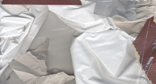
Materials related to Kelham Island and some on my previous projections, scanned and layered over one another to create interesting compositions segmented by the different textures. The smooth folds in the silk from where it's been flattened onto the scanner offer a strong contrast to the rough gritty textures of the sand paper and scrunched up sugar paper.
Material Edits
Distorted/manipulated in Photoshop
Imagery from Kelham with materials layered over thew top, along with photoshop filters and effects; creating a grainy texture interesting compositions.
Edited further on After Effects
I liked the grainy texture of the original compositions, but through some experimenting with filters and effects on after effects, I was able to create a matching aesthetic throughout (bubbilise effect) which perfectly conveyed the 'digital' and 'exaggerated' aesthetic I was looking to convey in comparison to the muted aesthetic of brief 1's book on the gentrification of Kelham Island.
Projection With Text
A projection based on the disorientation and change that gentrification can and has caused to some of the locals of Kelham Island and other areas which have under similar gentrification projects. The imagery used is made from distorted imagery from Kelham Island. Using scanned textures of materials which would be found and manufactured on Kelham Island and photoshop settings, the imagery is bold, fast paced and disorientating; as to present the impact of the change to Kelham Island locals.
High Quality
Here's the high quality version of the after effects edited video. The imagery is sharp and there is no buffering or mixing of colours.
Low Quality
The purpose of creating a low quality version was so that the imagery would look even more like it was glitching due to the slow clunky transitions between imagery which would leave parts of previous frames behind. This data-mashed aesthetic is interesting and does communicate the glitch aesthetic but it felt a bit overdone here so was a quite jarring to watch.
Projection Without Text
High Quality
Low Quality
Projections on Stencils
Bold contrasting colour from projection on metallic paper stencils of content from my book of people opinions of locals of Kelham Island on the gentrification of the area they live in. The changing of distance from the projector created created interesting forms and shapes on the sheets.
Projections onto Materials
(layering/fracturing imagery)
Projecting content onto chosen materials (same materials used to originally manipulate imagery). The layering of the materials fragments/distorts the form of imagery and type. These could be used alongside plinths to add another interactive dimension to the projection/installation
Subscribe to:
Comments (Atom)


