A machine/process that produces achievable new year goals
Subscription service to provide a frame work to follow new years resolution
Help Time management
- Calendar
- Watch
- Planner
- To Do List
Send the objects in January - then through the year you get emails linking to how the object can be used to make time management i.e. tips, articles, scholars.
Have people subscribe to a service, they get a package posted at the start of the year and motivational emails sent throughout the remainder of the year.
Target audience:
Target audience:
- people over 18 due to subscription, male or female.
- need to keep designs neutral to gender and age
- basic shapes and layout as to not distract from main design
Everyone went away to produce different style visuals that could be used across the different items within the subscription package.
Colours and shapes were decided on and various inspiration designs from other artists were provided for direction.
Calendar
Mel went for a more fine art, Bauhaus aesthetic with the shapes to give contrasting options for the group to choose between. Spaces below provided space for the calendar grid. Sense of layering and depth. The colours combined with the style of illustartion weren't cohesive, being a bit to niche which would narrow the customer base. It was agreed that it needs to be more simple and appealing to a wider range of people.
Inspired by the colour swatch created when deciding on colours. Simple shapes and layout that can be applied across all different outcomes


Planner Covers
Initial ideas for planner covers. Use of geometric shapes and gradients in first tests; into more illustrative forms in the second test.
These are somewhat in between the very simple designs using shapes and light colours and layout and the more complicated more developed neon, very 'graphic design' aesthetic which may be too strong of an aesthetic for a large target audience base.
Inner Pages
Inner page template for day by day calendar for activity planner. Colour scheme dependent on colour way of the month. Colours correspond with those used to segment the months in the calendar.
Bobbys Designs - with the dark and light blue colours mixed with the type futura felt a bit childish, despite the fact that it is bold, simple and modern.
Outer Pages
It was recognised that it was the colour scheme within the aesthetic that was making most if not all of the designs from each person feel childish and too associated to schools, this encouraged a move towards a more neon colour way.
After changing the colours we played around with the shapes in a way that would create depth and a more mature, adult feel to the aesthetic.
Realising that printing on neon coloured paper would produce a better result (and cheaper), the colours were reduced to monochrome black and white, however with white a colour that cannot be printed, the design simplified further with just black. (mezzotint)
those with fully black mezzatint were less successful and the shapes felt flat and one dimensional
the layering of shapes and the different arrangement of text in the yellow piece also worked together in creating a strong visual outcome, however this would not be appropriate for a general layout for all different forms (eg. calendar, needs room for grids, to do list, room for writing etc.)
We decided that these pages would work best for the front and back covers, for the planner and and to do list.
Planner
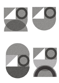
With the use of monochrome black and white shapes with a noisy filter, the planner follows the same aesthetic as the calendar and to do list creating aesthetic that could be replicated and customised (change colour) by customers, while still keeping its clear visual identity. With this particular mock up, the neon pink stock used for the calendar and to do list wasn't available so we had to use more of a pastel pink. If we were to develop this planner, the paper stock would need to be concurrent throughout all the products provided.

With the use of monochrome black and white shapes with a noisy filter, the planner follows the same aesthetic as the calendar and to do list creating aesthetic that could be replicated and customised (change colour) by customers, while still keeping its clear visual identity. With this particular mock up, the neon pink stock used for the calendar and to do list wasn't available so we had to use more of a pastel pink. If we were to develop this planner, the paper stock would need to be concurrent throughout all the products provided.

Printed in black and white due to printing costs, the inner pages consist of a week by week journal/planner; a contact page and an events page. The pages follow the same simple block colour grids; we avoided putting lined grids on the pages as we felt it would limit the space to write in. With a space/divider to write their overview of the month at the start of each calendar month the users can easily refer back to the space for any information they need.
Calendar
Calendar (update)
Mels work - Playing with the gradient, noise in shapes for a more simple layout that can be used across all platforms.
Structure for Calendar:
- Structure and direction for the visual imagery
- squares and triangles for winter months
- circles and semi circles for summer months
Following the same aesthetic, the calendar users the same shapes and noisy filter as seen in the planner, arrange in different forms on each page. The calendar is split into two halves, one being the shape visual on different coloured neon paper, and the other being the calendar dates. The user can flick through the pages to change visual and page colour.


No comments:
Post a Comment