Tear-Out |Book
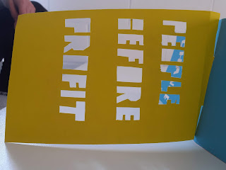
A tear off pamphlet style book, who's content would contain influential slogans used by corporations as a way to justify the changing of a place with no regard for locals. These slogans have been cut out (dye cut for developed book) so that the material or content it is layered over can be seen through the text, presenting the theme of the covering up/renewal of place, where the original building/place is still there but been given this new aesthetic.
Revolve Bind
This book contains similar content to the tear out book. The content is presented in an aesthetic where the reader can follow the book round in a circular motion, adding a continuous arc to the presentation of the content. Similar to the continuous changes and reuse of design in gentrification in our towns and cities.
Stencil Book
Bound by thick card individually for each page, the book contains stencils, when developed these would be relatable to the theme of gentrification and the associated themes with that (i.e. displacement, change, renewal), this mock up simply presents how a card bind between each page helps present the layered aesthetic to the stencil booklet. The change in shape and colour between the layered stencils could be loosely associated to the physical change after an area has be developed/gentrified.
Resisting Book
A book based on the documentary, Turbo Island, which looks at an area of Bristol that is being rapidly redeveloped against the wishes of some locals, this scrap of abandoned land is a complex example of clashing public and private interests. The documentary ask the question: if private owners allow land bought from the council to fall into ruin, does the community have the right to step in and fix it?
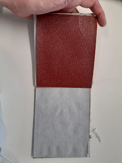
This question is presented in this book through 'resisting' sand paper materials used in the book duplex binded together, representing the local community who are fighting to get the space back and turn it into a positive space for the community.
The bind of the book is stapled as to present the rough industrial aesthetic of the book. This design choice was used to present the 'rough' ruined aspect of the area presented in the turbo island documentary. The book opens awkwardly and is uncomfortable to touch and look at, presenting themes current in turbo island.


No comments:
Post a Comment